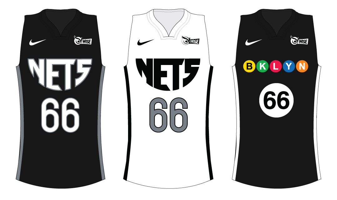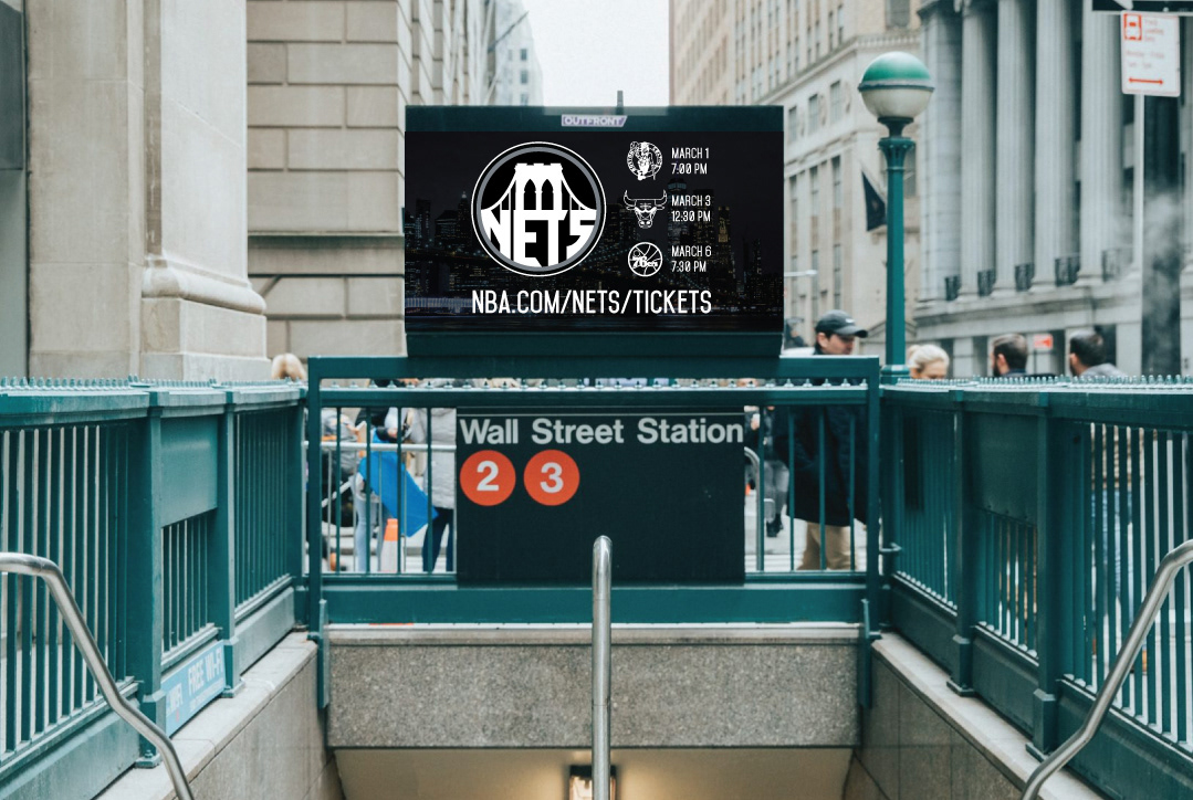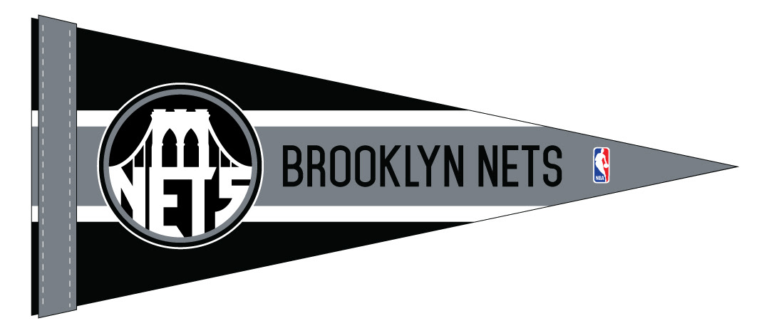

The inspiration to design a concept for a rebrand of the Brooklyn Nets comes from a logo that is too simple and lacks connection to the team's home in Brooklyn. The rebrand keeps the Nets' current black and white color scheme, highlights the Brooklyn's most iconic landmark, the Brooklyn Bridge, and incorporates lettering based on the Nets' logo of the 1990s and 2000s.